Hey Guys!As we have listen that, “Time is Money” but still people fail to realize the importance of it. Having a nice classic Analog Clock widget on your blog can be the nicest way to help your users to be punctual even if they are busy reading your content. Today I gonna going to show you how to add an analog clock widget in blogger.
Let start it Below.
How to add an Analog Clock in Blogger?
Before we start our tutorial, you would like to see analog clock widget in live action, so go to the live preview.
To Add a beautiful analog clock in Blogger carefully apply the following instructions on your blog.
Firstly, you need to install the analog clock scripts to your blog.Follow the given steps:
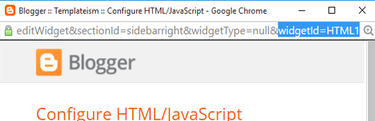
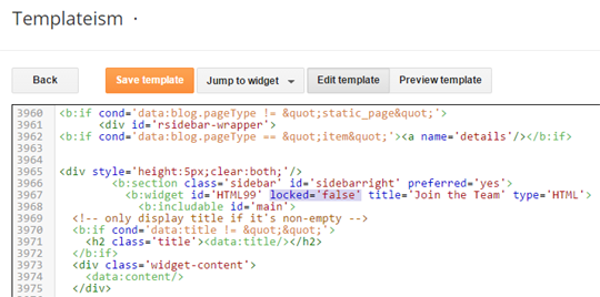
1. Go to Blogger Dashboard>> Template >> Edit HTML.
2. search for the </head> tag and just above the it paste the following code:
<script type='text/javascript'>
/*<![CDATA[*/
// MBL Analog Clock
initLocalClocks();
setUpMinuteHands();
function initLocalClocks() {
// Get the local time using JS
var date = new Date;
var seconds = date.getSeconds();
var minutes = date.getMinutes();
var hours = date.getHours();
// Create an object with each hand and it's angle in degrees
var hands = [
{
hand: 'hours',
angle: (hours * 30) + (minutes / 2)
},
{
hand: 'minutes',
angle: (minutes * 6)
},
{
hand: 'seconds',
angle: (seconds * 6)
}
];
// Loop through each of these hands to set their angle
for (var j = 0; j < hands.length; j++) {
var elements = document.querySelectorAll('.' + hands[j].hand);
for (var k = 0; k < elements.length; k++) {
elements[k].style.webkitTransform = 'rotateZ('+ hands[j].angle +'deg)';
elements[k].style.transform = 'rotateZ('+ hands[j].angle +'deg)';
// If this is a minute hand, note the seconds position (to calculate minute position later)
if (hands[j].hand === 'minutes') {
elements[k].parentNode.setAttribute('data-second-angle', hands[j + 1].angle);
}
}
}
}
function YourTime() {
// Get the local time using JS
//var date = new Date;
var hours = document.getElementById("hours_in").value;
var minutes = document.getElementById("minutes_in").value;
var seconds = document.getElementById("seconds_in").value;
document.getElementById('scy').style.animation='rotate 60s infinite steps(60)';
// Create an object with each hand and it's angle in degrees
var hands = [
{
hand: 'hours_y',
angle: (hours * 30) + (minutes / 2)
},
{
hand: 'minutes_y',
angle: (minutes * 6)
},
{
hand: 'seconds_y',
angle: (seconds * 6)
}
];
// Loop through each of these hands to set their angle
for (var j = 0; j < hands.length; j++) {
var elements = document.querySelectorAll('.your_time .' + hands[j].hand);
for (var k = 0; k < elements.length; k++) {
elements[k].style.webkitTransform = 'rotateZ('+ hands[j].angle +'deg)';
elements[k].style.transform = 'rotateZ('+ hands[j].angle +'deg)';
1
if (hands[j].hand === 'minutes_y') {
elements[k].parentNode.setAttribute('data-second-angle', hands[j + 1].angle);
}
}
}
}
/*
* Set a timeout for the first minute hand movement (less than 1 minute), then rotate it every minute after that
*/
function setUpMinuteHands() {
// Find out how far into the minute we are
var containers = document.querySelectorAll('.minutes-container');
var secondAngle = containers[0].getAttribute("data-second-angle");
if (secondAngle > 0) {
// Set a timeout until the end of the current minute, to move the hand
var delay = (((360 - secondAngle) / 6) + 0.1) * 1000;
setTimeout(function() {
moveMinuteHands(containers);
}, delay);
}
}
/*
* Do the first minute's rotation
*/
function moveMinuteHands(containers) {
for (var i = 0; i < containers.length; i++) {
containers[i].style.webkitTransform = 'rotateZ(6deg)';
containers[i].style.transform = 'rotateZ(6deg)';
}
// Then continue with a 60 second interval
setInterval(function() {
for (var i = 0; i < containers.length; i++) {
if (containers[i].angle === undefined) {
containers[i].angle = 12;
} else {
containers[i].angle += 6;
}
containers[i].style.webkitTransform = 'rotateZ('+ containers[i].angle +'deg)';
containers[i].style.transform = 'rotateZ('+ containers[i].angle +'deg)';
}
}, 60000);
}
//----------------------------------------------------------
/*]]>*/
</script>
After adding the script, the next thing you need to add is the CSS codes so now again in Template >> search for ]]></b:skin> tag and just above it paste the following code:
.label {
background: #fff;
border-radius: 0.3em;
color: #646464;
font-family: MyriadPro-Regular, 'Myriad Pro Regular', MyriadPro, 'Myriad Pro', Helvetica, Arial, sans-serif;
font-size: 1em;
font-weight: bold;
text-transform: uppercase;
padding: 1em 1em 0.6em;
position: absolute;
top: -4em;
left: 50%;
transform: translate(-50%, 0);
box-shadow: 0 7px 15px rgba(0, 0, 0, 0.2);
}
.label_y {
background: #fff;
border-radius: 0.3em;
color: #646464;
font-family: MyriadPro-Regular, 'Myriad Pro Regular', MyriadPro, 'Myriad Pro', Helvetica, Arial, sans-serif;
font-size: 1em;
font-weight: bold;
text-transform: uppercase;
padding: 1em 1em 0.6em;
position: absolute;
top: -4em;
left: 50%;
transform: translate(-50%, 0);
box-shadow: 0 7px 15px rgba(0, 0, 0, 0.2);
}
.clock_local {
border-radius: 50%;
background: #fff url(http://mybloggerlab.com/Images/clock.svg) no-repeat center;
background-size: 88%;
height: 300px;
width: 300px;
float: left;
position: relative;
box-shadow: 0 10px 20px rgba(0, 0, 0, 0.3);
}
.clock_local2 {
border-radius: 50%;
background: #bae2f6 url(http://mybloggerlab.com/Images/clock2.svg) no-repeat center;
background-size: 88%;
height: 300px;
width: 300px;
float: left;
margin-left: 50px;
position: relative;
box-shadow: 0 10px 20px rgba(0, 0, 0, 0.3);
}
.clock_local::after {
background: red;
border-radius: 50%;
content: "";
position: absolute;
left: 50%;
top: 50%;
transform: translate(-50%, -50%);
width: 4%;
height: 4%;
z-index: 10;
}
.clock_local2::after {
background: red;
border-radius: 50%;
content: "";
position: absolute;
left: 50%;
top: 50%;
transform: translate(-50%, -50%);
width: 4%;
height: 4%;
z-index: 10;
}
.minutes-container,
.hours-container,
.seconds-container,
.seconds-container_y {
position: absolute;
top: 0;
right: 0;
bottom: 0;
left: 0;
}
.hours {
background: #000;
height: 20%;
left: 48.75%;
position: absolute;
top: 30%;
transform-origin: 50% 100%;
width: 2.5%;
}
.minutes {
background: #000;
height: 40%;
left: 49%;
position: absolute;
top: 10%;
transform-origin: 50% 100%;
width: 2%;
}
.seconds {
background: #dc0000;
height: 45%;
left: 49.5%;
position: absolute;
top: 14%;
transform-origin: 50% 80%;
width: 1%;
z-index: 8;
}
.hours_y {
background: #000;
height: 20%;
left: 48.75%;
position: absolute;
top: 30%;
transform-origin: 50% 100%;
width: 2.5%;
}
.minutes_y {
background: #000;
height: 40%;
left: 49%;
position: absolute;
top: 10%;
transform-origin: 50% 100%;
width: 2%;
}
.seconds_y {
background: #dc0000;
height: 45%;
left: 49.5%;
position: absolute;
top: 14%;
transform-origin: 50% 80%;
width: 1%;
z-index: 8;
}
@keyframes rotate {
100% {
transform: rotateZ(360deg);
}
}
.hours-container {
animation: rotate 43200s infinite linear;
}
.minutes-container {
animation: rotate 3600s infinite steps(60);
}
.seconds-container {
animation: rotate 60s infinite steps(60);
}
.skin2 {
border-radius: 50%;
background: #fff url(http://mybloggerlab.com/Images/clock4.svg) no-repeat center;
background-size: 88%;
height: 200px;
width: 200px;
float: left;
position: relative;
margin: 20px;
box-shadow: 0 7px 15px rgba(0, 0, 0, 0.2);
}
.skin3 {
border-radius: 50%;
background: #fff url(http://mybloggerlab.com/Images/clock5.svg) no-repeat center;
background-size: 88%;
height: 200px;
width: 200px;
float: left;
position: relative;
margin: 20px;
box-shadow: 0 7px 15px rgba(0, 0, 0, 0.2);
}
.skin4 {
border-radius: 50%;
background: #fff url(http://mybloggerlab.com/Images/clock6.svg) no-repeat center;
background-size: 88%;
height: 200px;
width: 200px;
float: left;
position: relative;
margin: 20px;
box-shadow: 0 7px 15px rgba(0, 0, 0, 0.2);
}
.skin2::after {
background: red;
border-radius: 50%;
content: "";
position: absolute;
left: 50%;
top: 50%;
transform: translate(-50%, -50%);
width: 4%;
height: 4%;
z-index: 10;
}
.skin3::after {
background: red;
border-radius: 50%;
content: "";
position: absolute;
left: 50%;
top: 50%;
transform: translate(-50%, -50%);
width: 4%;
height: 4%;
z-index: 10;
}
.skin4::after {
background: red;
border-radius: 50%;
content: "";
position: absolute;
left: 50%;
top: 50%;
transform: translate(-50%, -50%);
width: 4%;
height: 4%;
z-index: 10;
}
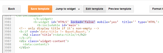
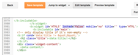
After adding the JavaScript and CSS codes its time to insert HTML codes that will play key role in displaying your analog clock, we have developed different themes for clocks.
Now following are the clocks along with there HTML code which can be used to display clocks on any part of your blog. Go to Blogger >> Layout >> Add a gadget >> Add HTML/JavaScript and paste any one of the following code:
Style#1
<div class="clock_local2">
<section class="label">Local time</section>
<div class="hours-container">
<div class="hours"></div>
</div>
<div class="minutes-container">
<div class="minutes"></div>
</div>
<div class="seconds-container">
<div class="seconds"></div>
</div>
</div>
Style#2
<div class="clock_local">
<section class="label">Local time</section>
<div class="hours-container">
<div class="hours"></div>
</div>
<div class="minutes-container">
<div class="minutes"></div>
</div>
<div class="seconds-container">
<div class="seconds"></div>
</div>
</div>
Style#3
<div class="skin2">
<div class="hours-container">
<div class="hours"></div>
</div>
<div class="minutes-container">
<div class="minutes"></div>
</div>
<div class="seconds-container">
<div class="seconds"></div>
</div>
</div>
Style#4
<div class="skin3">
<div class="hours-container">
<div class="hours"></div>
</div>
<div class="minutes-container">
<div class="minutes"></div>
</div>
<div class="seconds-container">
<div class="seconds"></div>
</div>
</div>
Style#5
<div class="skin4">
<div class="hours-container">
<div class="hours"></div>
</div>
<div class="minutes-container">
<div class="minutes"></div>
</div>
<div class="seconds-container">
<div class="seconds"></div>
</div>
</div>
Now once everything is done press "Save" and you have successfully added a analog clock to your blog. If you are good with CSS, you can customize the appearance of the widget otherwise you can enjoy the 5 different styles.
I hope that after reading this article you can easily add Analog Clock in Blogger.If you like this article share it on social media to help other blogger friends.
Let me know you if you have any problem regarding to this article.If you have any problem you can ank me in comment box.Thanks for reading this article.Stay tuned for more lectures.